An emoji picker that speaks your user's language.
Compose Emoji Picker drops a full Unicode picker into any screen — search matched to the device's language, recents remembered, colors pulled straight from your Material 3 theme.
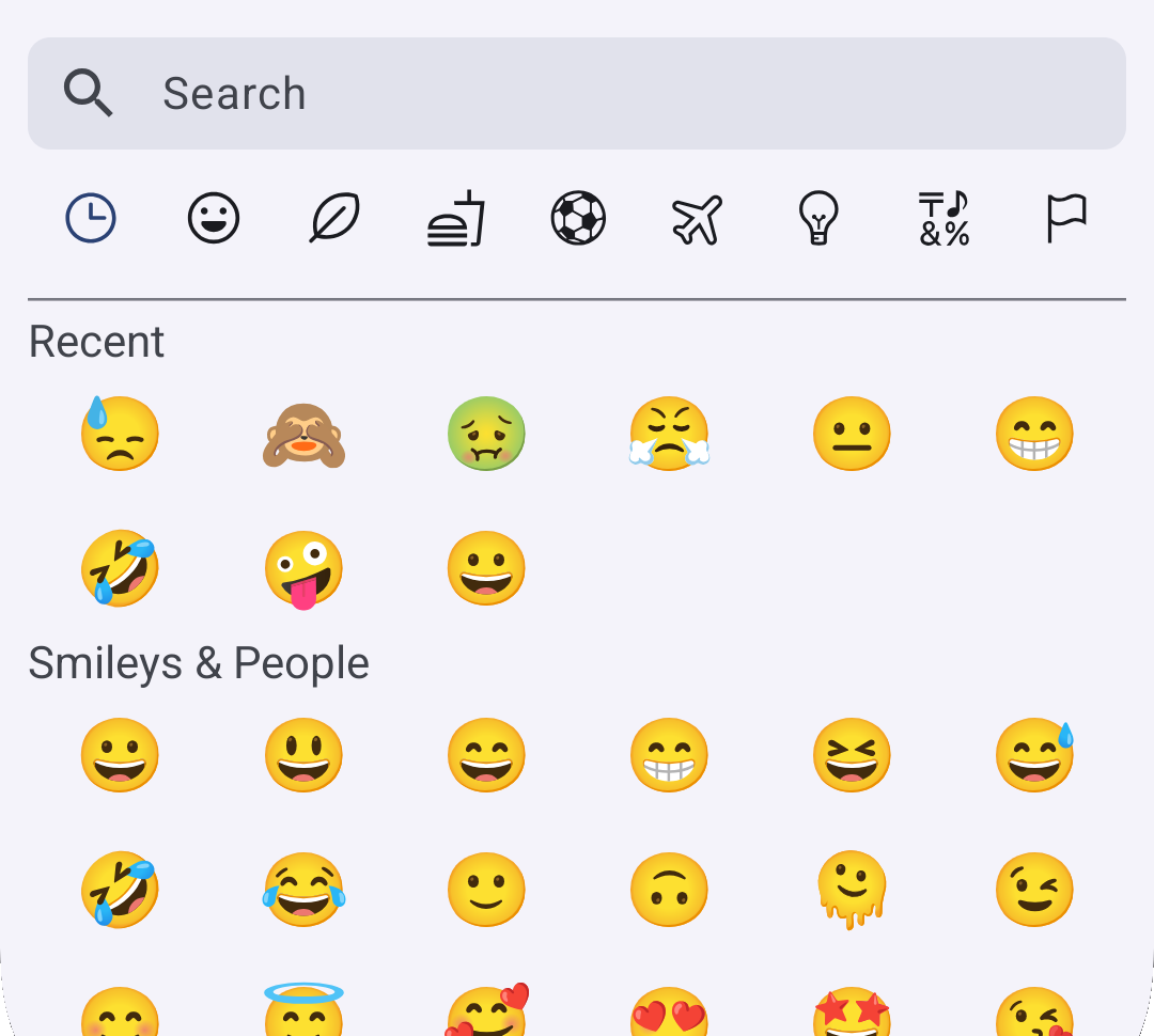
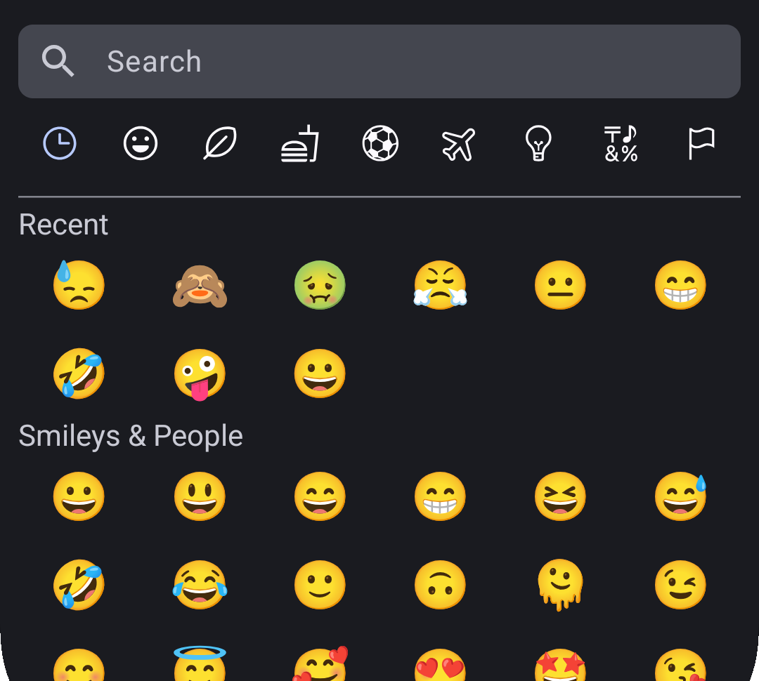
Everything a picker needs, nothing it doesn't
A wide range of emojis compatible with the latest Unicode standards.
Find emojis fast by category or name, right from the picker.
The last emojis a user picked stay one tap away, every time.
English and Italian, in both the UI and the search — more languages welcome via PR.
Built to drop into any Jetpack Compose screen without friction.
Search that matches how the device talks
Most pickers translate the emoji labels but still search in English only. This one matches the query against the device's own language, so typing in Italian finds the same emoji typing in English would.
Today: English and Italian — more languages land through pull requests.Light and dark, both native
The picker fully supports Light and Dark mode, automatically adapting to the colors defined in your Material 3 theme — no extra wiring required.
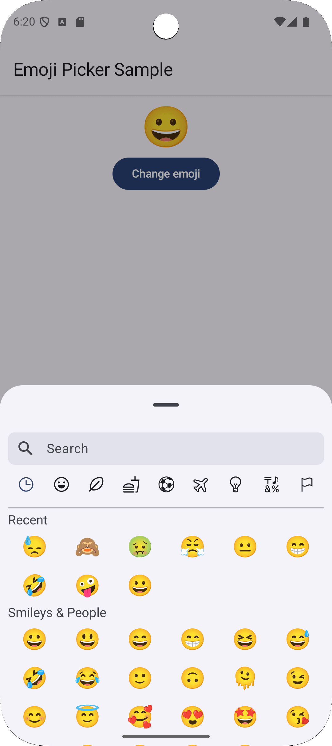
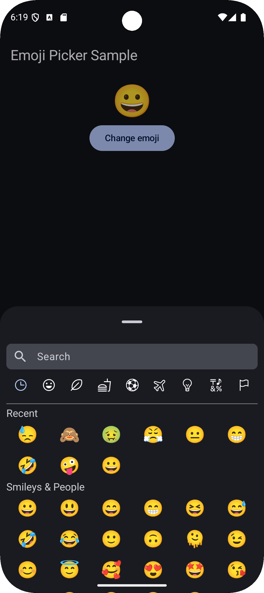
Three steps, one dependency
dependencyResolutionManagement {
    repositoriesMode.set(RepositoriesMode.FAIL_ON_PROJECT_REPOS)
    repositories {
        google()
        mavenCentral()
        maven(url = "https://jitpack.io")
    }
}Every parameter, every default
The full signature of the EmojiPicker composable — three required callbacks and one optional color set that follows your Material 3 theme unless you override it.
EmojiPicker(...)| Prop | Type | Default | Description |
|---|---|---|---|
| open | Boolean | required | Whether the picker is visible. |
| onClose | () -> Unit | required | Called when the picker should close. |
| onEmojiSelected | (emoji: Emoji) -> Unit | required | Called when the user taps an emoji. |
| colors | EmojiPickerColors | EmojiPickerDefaults.emojiPickerColors() | Colors used to paint the picker. |
EmojiPickerColors fields — defaults read from your MaterialTheme.colorScheme| Field | Default token | Description |
|---|---|---|
| backgroundColor | MaterialTheme.colorScheme.surfaceContainerLow | Background of the picker's container. |
| searchBarBackgroundColor | MaterialTheme.colorScheme.surfaceVariant | Fill color of the search field. |
| searchBarIconTint | MaterialTheme.colorScheme.onSurfaceVariant | Color of the search icon. |
| searchBarTextColor | MaterialTheme.colorScheme.onSurfaceVariant | Text and placeholder color inside the search field. |
| textColor | MaterialTheme.colorScheme.onSurfaceVariant | Color for category titles and the empty-state message. |
| activeCategoryTint | MaterialTheme.colorScheme.primary | Icon tint for the selected category tab. |
| inactiveCategoryTint | MaterialTheme.colorScheme.onSurface | Icon tint for unselected category tabs. |
Emoji — passed to onEmojiSelected| Field | Type | Description |
|---|---|---|
| id | String | Unique key for the emoji. |
| emoji | String | The emoji glyph itself. |
| name | String | Human-readable name, resolved to the matched search language. |
| slug | String | Identifier-friendly form of the name. |
| category | String | The Unicode category this emoji belongs to. |